It’s been a while since I last posted. Other things intervened; you know: life, the universe and everything. I have always been fascinated between the balance between use of digital and hand media in both design process and presentation drawings. The process is influenced by the medium, and in turn influences the output. Some people are adamantly pro-digital and others insist that hand drawings are the only way. Sometimes these positions are held with an almost religious fervour. Although I am old enough to have been trained with only hand media, I have a fascination for digital tools as well. I am a firm believer (there we go again – religiosity!) in the simple connection between brain/eye and hand when designing. Nothing works quite as well as a fat felt pen or a soft pencil on white detail paper. The freedom of movement and thought that this brings is unrivalled; digital programs tend to make designers focus on detail too early in the process.
There is also the question of what clients relate best to, which varies with individuals. I well remember a morning a few years ago when I attended two client presentations one after the other, both with quite polished CGI-style renderings with sophisticated light and shade. At the first, the client was ecstatic about the design and presentation, remarking on easy it was to understand everything. At the second, the client was almost monosyllabic, and afterwards the architect (who had been biting his tongue in the meeting) tore me off a strip for the method of presentation – “they’re alright for people like us [i.e. design professionals] but clients like hand drawings”. We used to get into similar muddles with plans, although these days we have a protocol for design plans. For initial presentations we use CAD layouts to start with, but generally trace over by hand before rendering in a watercolour style in Photoshop. This is partly because people react well to hand drawn plans, but also because at sketch design stage we want to give the impression of flexibility, of not every detail having been resolved. The same applies to planning applications. At later stages (such as discharge of conditions) the reverse is true and we always use CAD drawings in black and white.
SketchUp is an enormously powerful tool. It has been revolutionary in design as an accessible method of exploring three dimensions, in garden design in particular. However, its influence has in some cases become somewhat insidious. I have written about this in two previous posts, both worth dipping into: I’ve been using it increasingly, but I never touch it, and Thinking Outside the [White Rendered] Box. Actually I think as a profession we are beginning to move away from this now. The last two ‘best in show’ gardens at Chelsea illustrate this: Dan Pearson’s 2015 Chatsworth Garden and in particular Andy Sturgeon’s 2016 garden, which demonstrates a move towards a more angular dynamic approach to geometry.
For perspectives, having veered between different poles, we have now developed a hybrid method which seems to work well. Schemes are initially designed by hand, as is mostly the way in this office, with CAD layouts following soon afterwards. But for areas for which we are producing perspectives – often those that need further exploration or explanation – we develop 3D digital models, usually in SketchUp (geo-located for accuracy).
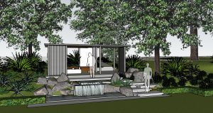
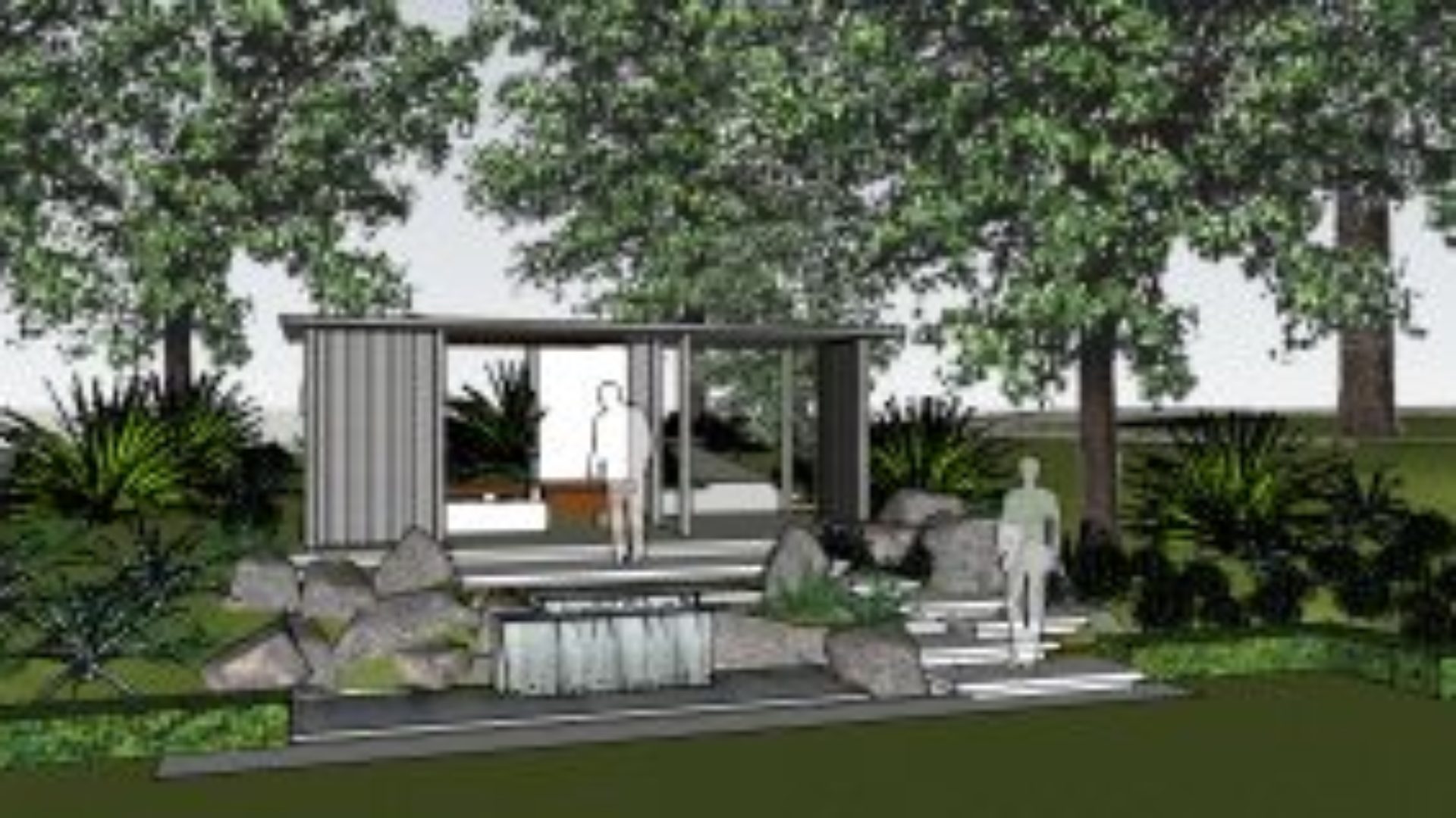
Fully rendered SketchUp tends to be rich in colour, but this can often be distracting.
In the past we have prepared fully rendered SketchUp models, but these days they are generally in plain white. Occasionally we show these to clients, but mostly we just use them to explore the space and elements. If you show clients fully rendered models, they tend to take them too literally. Once we are happy with the design, we output a view before using it as a base for a hand sketch.
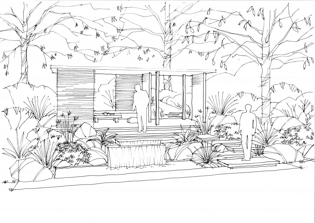
The line sketch. Note that this is really simple with no hatch, shading or detail. This is all added later.
These are simple unshaded line drawings, intended as a base for further rendering. We then scan the sketch and import a shadow layer directly from the 3D model, which adds greater depth and realism.
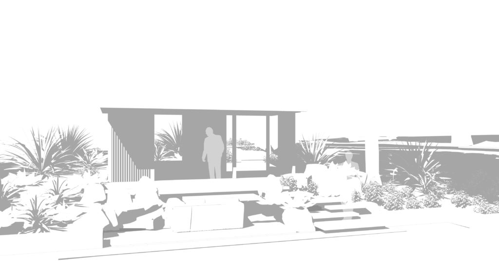
A shadow map layer, taken directly from the SketchUp model
Finally, the drawing is rendered in Photoshop using watercolour brushes. Although the whole process sounds laborious, it is actually relatively quick. Even so, there are often two or three people working on it sometimes with input or advice from others; we tend to work very collaboratively here.
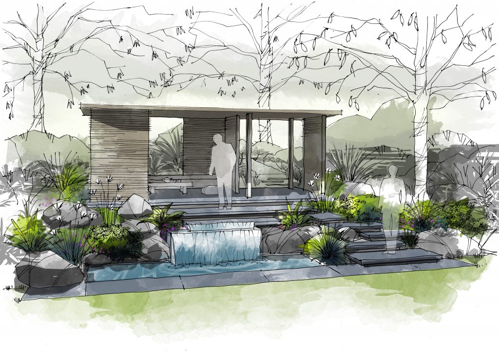
The finished sketch – light and airy with plenty of atmosphere. It has the advantage of showing detail where you want it but without being too literal.
The final result is usually graceful and airy, capturing something of the mood of the space whilst giving a genuine feel for the scale and texture. It is not for every project, but for those when you get short, infrequent slots with the client in which you have to work hard, this method is ideal.
January 24, 2017